Weekly Roundup

Weekly Roundup for October 31, 2022

There are two new enhancements coming to charts that should make sharing them easier. First, you can share through a link or in Teams chat. Second, you can also copy a chart as an image, with or without a caption. Both options can be accessed through the new right-click menu.


While this article is not really specific to Snowflake, it does thoroughly cover some fundamental and best practices in data modeling and operationalizing your Power BI reporting.


The October 2022 Power Apps feature update is out. A few of my favorite items:

  1. Support for Azure AD dynamic user membership based on rules

  2. Public preview of coauthoring

  3. Public preview of maker matching

  4. Print to PDF


If you ever needed to create a popup window in your Power BI report — to display information, to show slicers, etc. — Patrick Leblanc has you covered.


I thought this video was a great example of both a couple different great techniques to solve a common scenario (SWITCH and calculation groups) and the general process of iterating a solution. Try something. If it’s not right, keep enhancing!


This is a bit geeky, but if you want to get serious about improving the performance of your Power BI reports, this tool provides a ton of great information.


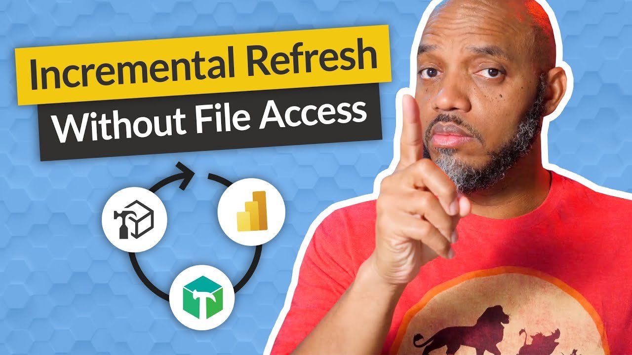
I love learning new things you can do in Tabular Editor. Here, Patrick Leblanc shows you how to set up incremental refresh in the Service (i.e., without Power BI Desktop).


Adam Saxton has a good overview of the admin of custom visuals. I didn’t realize you could deploy a custom visual to an entire tenant without users having to search for it.

Weekly Roundup for November 15, 2021

In app-dev shops, two or more engineers can work on the same bit of code and see and merge changes through a tool called Git. Microsoft is bringing this experience, backed by Azure DevOps, to Power Apps Studio (as an experimental feature). This is great, and I just hope that they bring something similar to Power BI.


The November 2021 feature summary for Power BI is out!


If you have any page- or report-level filters on a report, it’s always a good idea to let your report consumers know what filters are in place. Patrick Leblanc shows you how to do that a couple ways, including by adding that information to the tooltip of a visual.


I’m really excited to see where this goes. Microsoft is essentially creating a programming language out of the code used in Excel, meaning that hundreds of millions of Excel users could potentially create no-code, low-code solutions.


If you need a Profit & Loss custom visual for Power BI, this could work for you.


For people who want to export data from a Power BI report to explore it in Excel, Microsoft is improving this capability by maintaining current layout, datatypes, and MIP.


Marc Lelijveld has a great article about how to update a single table in your Power BI dataset, and you can use it to update the table after the data source’s ETL processes are complete. Really fascinating, if rather technical.


Now that Power BI Premium Gen 2 is Generally Available, it’s important to get the details. Adam Saxton has you covered. I didn’t realize that the 25-Gb limit is now for each given dataset and not for the total capacity of the node.

Weekly Roundup for November 1, 2021

If your corporation is running a Microsoft data stack, they really should consider Azure Purview. It helps your organization get a 360 view of your entire data landscape.


Microsoft Ignite is tomorrow. Be sure to sign up and check it out. Personally, I’m interested in hearing about driving a data culture by Anton Fritz and Gaurav Malhotra.


When thinking about optimizing your Power BI models, there two things you want to think about: your RAM consumption and your CPU utilization. Adam Saxton explains the latter.


Reid Havens has videos featuring a lot of neat visualization tricks. I thought this one using the new custom button feature was really useful.


In case you are looking to hire a BI developer, Chris Wagner has a rundown of the skills you should be looking for and the different profiles most BI developers fall into. It is also useful for anyone looking to get a job in BI.


One of the great, and challenging, things about paginated reports is that you can customize anything with code. Patrick Leblanc shows you how to use this to implement conditional formatting in paginated reports.

Weekly Roundup for October 25, 2021

I don’t normally post things behind a paywall, but I enjoyed this article too much not to share it. This Economist article talks about how economists are using access to large, novel, realtime datasets to make surprising discoveries.


I didn’t realize this, but you can use a developer tool in Edge to emulate vision deficiencies when building out your Power BI reports.


I thought this was a pretty slick way to have dynamic, configurable analytics lines in your native Power BI visuals. I can think of a bunch of places where I could make use of this.


I wish I had known about this trick this morning. I had to take over a Power BI dataset to fix some connections issues. This PowerShell solution would have simplified things greatly.


This is a foundational video, but if you need, or know someone who needs, an explanation on all those four hundred or so connectors within Power Query, then here you go.

Weekly Roundup for October 18, 2021

The October 2021 update to Power BI is out!


Reid Havens has a handy way for bounding your date table with automatic beginning and ending dates. This is a really good thing to have if you don’t have access to a Dimension Date table in your data warehouse.


Patrick Leblanc shows you how to apply conditional formatting, but I also liked his use of a play-axis certified custom visual that animates the graph.


Well, you learn something new every day. This is not novel, but I didn’t know that you can use the DAX function EXACT to enforce case sensitivity.


Similar to his previous video, Adam Saxton gives you a great roundup of resources for Power Query. No matter where you are on your journey, definitely check this out.

Weekly Roundup for October 11, 2021

If you’re around on Monday, October 18, I’ll be presenting at Nashville’s premiere analytics conference, the Nashville Analytics Summit, on the basics of Data Modeling for Power BI. Be sure to stop by, or attend virtually!


Microsoft is making Power BI Premium Gen 2 (or Next-gen Premium, as they’re calling it now) generally available. If you use Premium capacity and have not yet upgraded, this will really help scale and enhance your workloads.


I get asked this all the time: What resources do you recommend for learning Power BI / DAX? Adam Saxton gives you a great list of resources for beginners, intermediates, and experts.


Microsoft is previewing an API to see artifacts not used in the last 30 days. If you are an admin, this will be very useful.


You know how you can double-click on a measure in a Pivot Table in Excel to examine the rows of the data within the filter context? Marco Russo and Alberto Ferrari have a great tip for customizing the results when connecting to Power BI datasets. This is really useful for people who want to examine their data at a high level and go into a row-by-row level of detail.

Weekly Roundup for October 4, 2021

In case you missed it, be sure to check out my talk with the Nashville Power BI User Group on basic data modeling.

In our BI journey, we all hit a plateau in our learning curve. One reason is that we haven't modeled our solution correctly. In order to move to the next level of our journey along the BI learning curve, we need to understand how a tool like Power BI works. Only then will we understand why we design our data models the way we do. In this session, we will review how the way tools like Power BI work impact the way we build data models.


Microsoft is advancing the status of AI in Power BI with Insights. It provides…well, insights into anomalies and changes in your data with very little setup from the end user. I imagine that it would require a well articulated model, and the hopes and expectations for AI capabilities regularly exceed their initial capabilities, but with any luck this could make self-service BI that much more complete.


If you’ve ever needed a quick way to create a table on the fly within a DAX measure, Alberto Ferrari shows you how to use the DATATABLE function. Really handy!


I love Tabular Editor 3, and one of the great, little-know features is the ability to create scripts to automate a lot of the things that you do repetitively. Patrick Leblanc shows you how to use that feature to create time-intelligence calculation groups with just one click.


Marc Lelijveld has a great decision tree to help you decide whether you need Power BI Premium. Definitely worth a look!


If you’ve ever wondered about the difference between Azure Synapse Analytics and Snowflake and why you might choose one over the other, BlueGranite has an interesting article walking you through the pros and cons of each.

Weekly Roundup for September 13, 2021

This is a great example of how to troubleshoot DAX by going back to the basics of context filtering and walking through the steps of what exactly the function is doing. Even if you never use ALLEXECPT, this is a great video by Alberto Ferrari to demonstrate that principle.


In our BI journey, we all hit a plateau in our learning curve. One reason is that we haven't modeled our solution correctly. In order to move to the next level of our journey along the BI learning curve, we need to understand how a tool like Power BI works. Only then will we understand why we design our data models the way we do. In this session, we will review how tools like Power BI work how that impacts the way we build data models.

About: Michael McKinley is the founder of McKinley Consulting. Michael has managed data transformation projects for the last nine years. He is Microsoft Certified in Power BI and the Power Platform and has worked with major clients such as HCA, FedEx, and the United Methodist Church, among others.


Sometimes, it’s good to return to the fundamentals. If you are connecting a Date table to a fact table, you have to connect columns of data type date. Patrick Leblanc shows you why.


If you’ve ever been curious about the XMLA endpoint, what it is, and what you can do with it, Adam Saxton walks you through all the basics.


I keep getting asked when it is best to solve a problem with data transformation (i.e., Power Query & M) and when it is best to solve a problem with DAX (or proper data modeling). Matt Allington and Ken Puls walk you through which technique to use when.

Weekly Roundup for August 30, 2021

When these AI offerings first come out, they don’t always function as promised, but I will be interested to see how this evolves. This is the first step in a broader commitment to writing code via natural language to empower even more citizen developers. Microsoft does caveat that the scope is currently narrow, but they are working on expanding that.


Even if you don’t have a need to refresh a single table in your Power BI dataset, you should watch this video. Patrick Leblanc walks you through several nice ways to interact with your model via a number of tools, including SSMS, Tabular Editor 3, and scripts. I especially liked the integration with Azure DevOps.


Matt Allington has a neat trick to rename several columns simultaneously in Power Query. It uses a list of lists created within the same query.


I wish I had known this since the beginning. You know how how Power BI doesn’t show dimensions for which there is no data? ADDMISSINGITEMS allows you to very easily put them back in.


If your Power BI report is slow, Adam Saxton walks you through the basic steps to measure its performance and see what’s taking up the most time.


Reid Havens has an extension of a video he did last week, this time allowing you to switch the category by which you break down the waterfall and to switch between a dynamic value and 0 for Y axis start.

Weekly Roundup for August 23, 2021

Forrester is out with their 2021 Q3 Wave. They said that “[i]t is hard not to consider Power BI as your top choice for an enterprise BI platform….” My thoughts exactly.


I will be speaking at the 2021 Nashville Analytics Summit on Introductory Data Modeling. This is the premier data-focus conference in Nashville and is not to be missed. The conference is both in-person and virtual, so whether you can attend in person or not, be sure not to miss this one.


This is a big step forward for making PowerApps solutions enterprise-grade. You use connection references and environment variables in PowerApps, meaning that you can build an app in a Dev environment connected to a Dev data source, and then move the solution to a Test environment and connect it to a Test data source, and all you have to do is point it to a JSON file where the environment connections are stipulated.


While I haven’t had an occasion to use the Visio visual for Power BI, I love what you can do with it. Lots of potential and use cases. Patrick Leblanc gives you an introduction.


Reid Havens has a neat idea with Waterfall graphs that allow you to use slicers to switch out the beginning and ending comparison values.