Many organizations don’t realize how much faster and more accurate their decision-making would be if they were better at data visualization. Indeed, most organizations struggle with seeing and understanding their data. (Think about some of those 100-page slide decks and 60-column spreadsheets.)
In this live session, best-selling author and data visualization consultant Steve Wexler will share insights on how to get your organization to "get" data visualization.
Attend and learn:
Why “just the numbers” isn't good enough
The “gateway drug” to data visualization
Why we see so many bar charts
Why most people make a mess of using color
The secret to engaging your stakeholders and the power of disaggregated data
What you should always, always, always keep in mind
If you’re new to data visualization, this webinar will help you understand the benefits of well-designed charts and dashboards. If you are experienced in data visualization, this webinar will help you evangelize its use in your organization.
About: Steve Wexler is the founder of Data Revelations, co-author of The Big Book of Dashboards: Visualizing Your Data Using Real-World Business Scenarios, and author of the upcoming book The Big Picture: How to Use Data Visualization to Make Better Decisions—Faster.
Steve has worked with ADP, Gallup, Johnson & Johnson, Deloitte, ExxonMobil, Convergys, Consumer Reports, The Economist, SurveyMonkey, Con Edison, D&B, Marist, Cornell University, Stanford University, Tradeweb, Tiffany, McKinsey & Company, and many other organizations to help them understand and visualize their data.
A winner of numerous data visualization honors and awards, Steve also serves on the advisory board to the Data Visualization Society.
His presentations and training classes combine an extraordinary level of product mastery with the real-world experience gained through developing thousands of visualizations for dozens of clients. Steve has taught thousands of people in both large and small organizations and is known for conducting his seminars with clarity, patience, and humor.
Microsoft is releasing a new app designer for model-driven apps.
Brett Powell has a great article about changes in Power BI that can break your datasets. He goes through common causes and how to avoid them.
You can now embed Power BI reports, dashboards, and tiles into Salesforce. I’ll be curious to see how people make use of this.
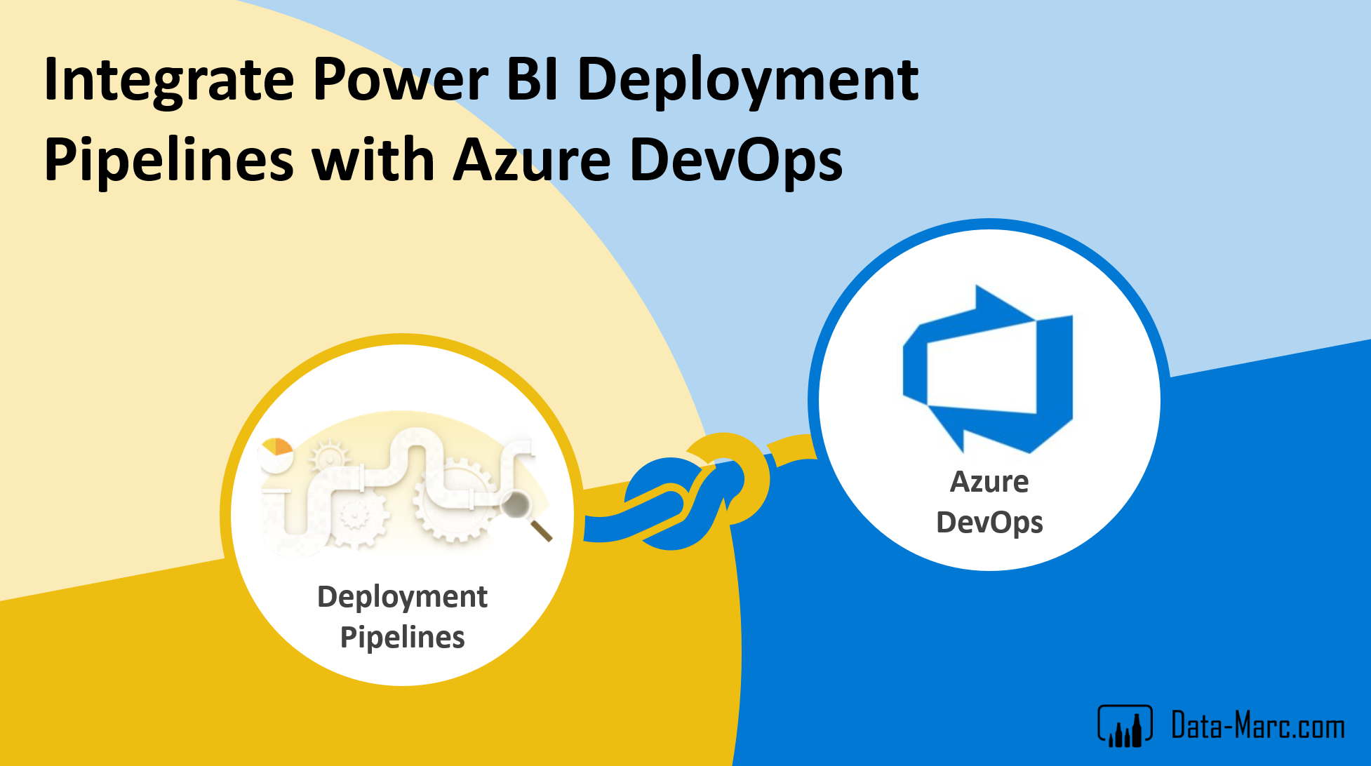
Marc Lelijveld has a terrific article showing how to integrate Power BI Deployment Pipelines into Azure DevOps. If you’re working on enterprise-class business intelligence, this is the new best practice you should be emulating.


